CSS实战 - 角标
1、实现效果
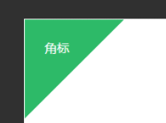
2、实现原理
采用绝对定位使 div 元素定位在左上角,在 div 里面画三角形作为背景。
画三角的三种方法:
① 使用线性渐变的背景色,从左上角向右下角(135度角)进行渐变,渐变到50%时把颜色设为透明
② 使用 border 属性制作三角形,设定 div 宽高都为0,定义上边框(border-top)的属性,并把右边框(border-right)的颜色设为透明
③ 定义一个带背景色的 div,旋转45度角,利用 margin 调整位置,使 div 的一条边和角落的两条线相交,对超出内容部分进行隐藏
3、具体代码
<!DOCTYPE html>
<html lang="en">
<head>
	<meta charset="UTF-8">
	<title>CSS实战 - 角标</title>

	<style type="text/css">
		 body {
            background-color: #333;
            color: #fff;
        }

        .container {
            position: absolute;
            top: 30%;
            left: 30%;
            width: 40%;
            height: 40%;
            border: 1px solid rgba(255, 255, 255, 0.3);
            background: #fff;
        }

        /************以下为具体实现************/

        .superscript {
        	position: absolute;
        	top: 0px;
        	left: 0px;
        	width: 130px;
        	height: 130px;
            overflow: hidden;
        }

		/* 使用背景色渐变 */
        .superscript .gradual {
        	width: 100%;
        	height: 100%;
			background: linear-gradient(135deg, #31b968 50%, transparent 50%);
        }

		/* 使用三角形 */
        .superscript .triangle {
			width: 0;
		    height: 0;
		    border-top: 130px solid #31b968;
		    border-right: 130px solid transparent;
        }

        /* 使用矩形旋转, 和父节点的 overflow:hidden 配合 */
        .superscript .rect {
        	width: 183px;
		    height: 183px;
		    margin: -91px 0 0 -91px;
		    background: #31b968;
		    transform: rotateZ(45deg);
        }

        .superscript .desc {
        	position: absolute;
        	top: 20%;
    		left: 20%;
        	z-index: 1;
        }
	</style>
</head>
<body>
	<div class="container">
		<div class="superscript">
			<!-- 角标的三种实现 -->
			<!-- <div class="gradual"></div> -->
			<!-- <div class="triangle"></div> -->
			<div class="rect"></div>

			<div class="desc">角标</div>
		</div>
	</div>
</body>
</html>